
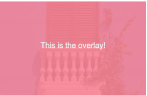
In this post, I’ll show you how to create a simple CSS overlay such as the one pictured below:

Create an Inner <div> and Outer <div>
In your HTML file, you’ll want to create an outer <div> and an inner <div>. The outer <div> will appear on page load, and the inner <div> will appear on hover.
<html>
<head>

  <meta charset="utf-8">
  <title>How to Create a CSS Overlay</title>
  <link rel="stylesheet" href="stylesheets/style.css">

</head>
<body>

  <div id="outer-box">
    <img src="cartagena.jpg">
    <div id="inner-box">
      <p>This is the overlay!</p>
    </div>
  </div>

</body>
</html>
CSS
In your CSS file, you’ll want to set the outer <div> to position: relative, while the inner <div> should be set to position: absolute. The inner <div> should be set to top: 0 and left: 0, with width: 100% and height: 100%.
Once you’ve set these properties, you can customize the color, opacity, transition, etc. You can also add an image to the overlay.
I originally coded this in SASS, so I’ll include both the SASS and compiled CSS below:
SASS
$pink-color: #FD8698;

#outer-box {
  width: 300px;
  height: 194px;
  display:block;
  position:relative;

  img {
    width: 300px;
    height: auto;
  }

  #inner-box {
    background: $pink-color;
    height: 100%;
    width: 100%;
    opacity: 0;
    top: 0;
    left: 0;
    position: absolute;
    padding: 0;
    transition: opacity .5s;

    p {
      color: #fff;
      line-height: 150px;
      font-family: 'arial';
      text-align: center;
    }
  }

  &:hover {
    #inner-box {
      opacity: .9;
      transition: opacity .5s;
    }
  }
}
CSS
/* line 3, ../sass/style.scss */
#outer-box {
  width: 300px;
  height: 194px;
  display: block;
  position: relative;
}
/* line 9, ../sass/style.scss */
#outer-box img {
  width: 300px;
  height: auto;
}
/* line 14, ../sass/style.scss */
#outer-box #inner-box {
  background: #FD8698;
  height: 100%;
  width: 100%;
  opacity: 0;
  top: 0;
  left: 0;
  position: absolute;
  padding: 0;
  transition: opacity .5s;
}
/* line 25, ../sass/style.scss */
#outer-box #inner-box p {
  color: #fff;
  line-height: 150px;
  font-family: 'arial';
  text-align: center;
}
/* line 34, ../sass/style.scss */
#outer-box:hover #inner-box {
  opacity: .9;
  transition: opacity .5s;
}
You can also view this code on GitHub.
Product manager at Facebook. Former senior product manager at Dollar Shave Club in Los Angeles and software engineer at J.Crew / Madewell in New York City. Recovering trial lawyer.
Latest posts by Koren Leslie Cohen (see all)
- PM Career Story - April 28, 2022
- How to Transition into Product Management - December 26, 2017
- What I’ve Learned in My First Few Months as a Product Manager - October 14, 2015


Excelente tutorial, algo fuera del tema, ¿tienes alguna experiencia con ember.js y qué opinas?
I love you Koren, you’re genius, it works 😉
Many thanks to share it.
I will send you the result as soon as my project will be on line.
Right on!
thanks for code, this is what i was looking for
Oh wow, this is the first solution that is both easy and working for me!
Thanks a bunch for the guide, I appreciate it 🙂
You’re welcome!
What would be the best way of going about rounding the corners of the overlay?
Great Post btw! The only one I could find that worked!